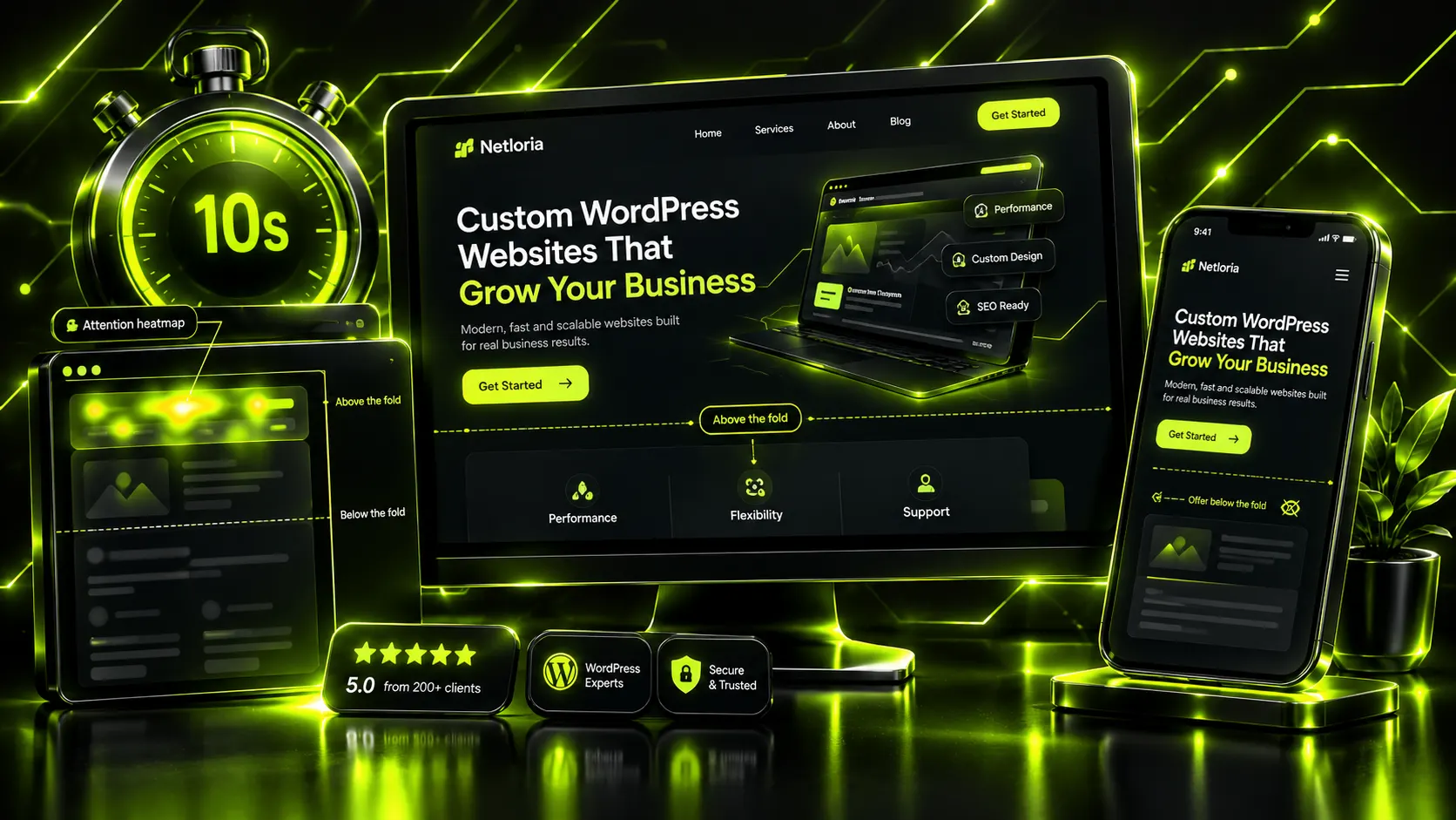
⚡ Quick answer: The first screen is the part of a page a visitor sees without scrolling, and within a few seconds it has to tell them where they are, whether it’s for them and what to do next. So it needs a specific offer headline, a clarifying subheadline, one main button with a verb, a trust signal and an image that shows what the product actually is. Check it on a smartphone first, where the screen is much shorter.
Picture your website as a salesperson on the shop floor. They have a few seconds before the customer turns back toward the door. According to Nielsen Norman Group, most people decide whether to stay or leave within the first 10 seconds of a visit, and that is exactly the window in which you have to explain why they need you. The whole decision happens on a single screen — the website first screen, visible before the first scroll.
At Netloria we design dozens of landing pages and home pages every year, and the most common reason for weak conversion isn’t the button color or the font. It’s a first screen that doesn’t answer the visitor’s simple question: “Am I in the right place?”
Let’s take it apart piece by piece: what belongs above the fold, how a landing page’s first screen differs from a home page’s, which mistakes we see in almost every audit — and how to check your own in five minutes.
The first screen (also called the area above the fold — the term comes from newspapers folded in half, where the most important stories were printed on the top half) is what a visitor sees immediately, without scrolling. On desktop that’s roughly the top 700–900 pixels; on a smartphone it’s even less.
Mobile deserves a separate word, because that’s where most of the losses hide. On a phone the first screen is two or even three times shorter than on desktop, and a big, beautiful banner that left room for a headline and a button on a monitor swallows them completely on a smartphone — the visitor sees only the picture and has to scroll just to understand where they’ve landed. And since most traffic comes from mobile in almost any niche, check your first screen on a phone first and on desktop second, not the other way round.
Scrolling isn’t dead, that’s true. People scroll willingly today. But attention is still spread very unevenly: according to an NNGroup eyetracking study, the area above the fold gets about 57% of all page viewing time, and the first two screens get 74%. Further down, interest drops sharply.
Hence the simple arithmetic of attention. You can build a brilliant block of reviews and a detailed service description somewhere in the middle of the page — but if the first screen didn’t hold the person, they will never reach that block. The top few hundred pixels work not as a cover but as a filter: they decide whether there will be a second screen at all.
When someone opens a page, what’s in their head isn’t admiration for your design but anxiety and haste. They silently ask three questions and expect an answer within seconds:
If the first screen fails to answer even one of them, the visitor leaves. Not because they didn’t like it, but because they didn’t understand it. And on the internet, not understanding costs exactly one click on “back”.
The most expensive mistake here is confusing beauty with clarity. A first impression of design really does form in a fraction of a second; we covered that mechanism in detail in our article on how design drives customer choice. But a nice gradient won’t answer the question “Is this for me?”. Words do.
There’s no single template that fits everyone. But there is a set of elements that almost always need to be in view without scrolling — and each of them answers one of the three questions above.
The offer (main headline). This isn’t your company name or a slogan like “We make the world a better place”. It’s a specific promise of a result: what the customer gets and who it’s for. “We build turnkey online stores in 3 weeks” works because it has both the what and the how fast. “Welcome to our website” doesn’t work at all.
A clarifying subheadline. One or two lines that remove an objection or add specifics to the offer: who it’s for, why you, what’s included. The headline catches the eye; the subheadline holds it for one more second.
Call to action (CTA). One main button with a verb, not “Learn more”. “Send a request”, “Get a price estimate”, “Book a consultation” — people should see what will happen after the click. Two or three equally weighted buttons side by side blur the focus: when everything is important, nothing is.
A trust signal. Something, anything, that removes initial distrust right on the first screen: a counter of completed projects, client logos, star ratings, a short fact with a number. It doesn’t have to be a lot — it has to be there straight away.
A visual anchor. An image or a short product shot that shows the substance, not an abstraction. Honesty matters here: a real photo of your team or product works better than a perfect stock image of smiling strangers shaking hands.
And separately — navigation. It’s on the first screen too, but its job is the opposite of the offer’s: not to attract attention, but to stay out of the way. A 12-item menu in the header is 12 reasons to go somewhere other than where you want them to go.
A common mix-up: an owner sees a competitor’s great landing page and wants “the same” on the home page of their company website. But the jobs are different, and the first screen is built differently for each.
| Element | Landing page first screen | Home page first screen |
|---|---|---|
| Main goal | One action — a request or a purchase | Orient visitors and route them to sections |
| Offer | Narrow, for one product/promotion | Broader — the essence of the whole company |
| CTA | One dominant button | Main action + paths to key sections |
| Navigation | Minimal or hidden entirely | Full menu — it’s the entry point to the site |
| Success is measured by | Conversion into requests | Whether the visitor found their path |
At Netloria we often start a project with exactly this distinction. If a client needs a stream of requests for one service, it’s a landing page, and the first screen aims at a single target. If different audiences need to find different things, it’s a home page, and its first screen is more of a dispatcher than a salesperson. Doing it the other way round is a typical reason an expensive website “doesn’t sell”.
This isn’t theory. It’s what we find in every second audit before a redesign.
1. A slider carousel instead of an offer. It seems that three rotating banners are three messages for the price of one. In reality, people don’t manage to read any of them because the next one has already slid in, and the brain perceives motion as an ad banner to be ignored. One strong offer always beats three weak ones spinning around.
2. A vague offer about “quality and service”. “Individual approach”, “team of professionals”, “wide range of services” — these words carry no information, because everyone writes them about themselves. If your headline could be placed on a competitor’s website unchanged, it isn’t an offer, it’s noise.
3. A “Learn more” button. It doesn’t promise anything specific, so hardly anyone clicks it. A verb of result is always stronger than a verb of process.
4. Stock photos that kill trust. Perfect smiling models in suits read as “this isn’t true” faster than we consciously notice. By the way, this is important to remember in copy too — we covered how to write honestly and to the point in our article on copy for a service page.
5. Overload. When the first screen has a promotion, a 15-item menu, a chatbot, a pop-up and three buttons all at once, attention has nothing to hold on to and slides off. Clarity comes from subtraction, not addition.
The offer is the most expensive 8–12 words on your entire website, so it’s worth spending more time on them than on the rest of the page combined. A simple working formula we usually start from: [what you do] + [for whom] + [key benefit or proof]. For example: “We build WordPress online stores for local businesses — with content and payments set up in 3 weeks.” Here a person understands in a second the product, that it’s relevant to them, and why it’s fast. Now remove any part and the offer starts to leak: without “for whom” it sounds like an ad for everyone and no one at once, without the benefit it turns into a dry service name, without a specific timeframe or number it becomes a slogan that fits half the market equally well. That’s exactly why template lines like “Your reliable partner” or “Quality solutions for business” hold no one: they contain none of the three parts, and therefore no information the decision to stay on the page could latch onto.
The second technique we love at Netloria is to speak the language of the client’s result, not the language of your own process. People don’t buy a “redesign” — they buy more requests from the same traffic. Not “SEO optimization”, but customers who find them on Google on their own. Rewrite your headline so it contains the result rather than the name of your service, and the first screen will immediately start sounding like it’s about the visitor, not about you.
And the final check — specificity. The brain lets “fast” slip by. “In 3 weeks” it registers and remembers.
You don’t need to commission expensive research to see the obvious. Here is a quick self-test we recommend to clients before any redesign.
Go through these four points right now. Most often by the second one it becomes clear what exactly is holding conversion down — and it’s almost always something that can be fixed in an hour of work rather than by rebuilding the whole site.
The first screen isn’t about beauty. It’s about whether the visitor manages to understand they’re where they need to be before their finger reaches for the “back” button. Everything else on the page only works once that second has been won.
At Netloria we design landing pages and websites starting not with a picture, but with the offer and the logic of the first screen — the things that actually affect requests. If your site gets visitors but few enquiries, the problem is most likely right here. Order a landing page from Netloria — we’ll review your first screen, find what’s stopping customers and build a page that leads to action.
In most cases, no. Banners change faster than people can read them, and motion on a page is perceived as advertising, which the brain is used to ignoring. One clear offer with a button works better than three messages replacing each other.
One main button that matches the page’s primary goal. On a landing page that’s almost always a request or a purchase; on a company home page, links to key sections are acceptable alongside it, but the main action should visually dominate. Several equally weighted buttons scatter attention, and people end up clicking none of them.
A specific promise of a result: what you do, for whom, and the key benefit, timeframe or number. Your company name, “Welcome” or “reliable partner” isn’t such a headline, because it tells the visitor nothing. A good check: if the headline could be placed on a competitor’s website unchanged, it needs rewriting.
Only if the site sells one service or product. A landing page leads to one action and minimizes navigation, while a home page has to orient different audiences and route them to sections. If you move landing-page logic onto the home page of a multi-service company, some visitors simply won’t find what they need.
A real photo of the product, the team or the result of your work that shows the essence of your offer. Stock photos of smiling models read as fake and lower trust. On mobile, make sure the image doesn’t push the headline and button off the screen.
Обговорюємо саме цю послугу у вашому проєкті?
One-Page Website (Landing Page)