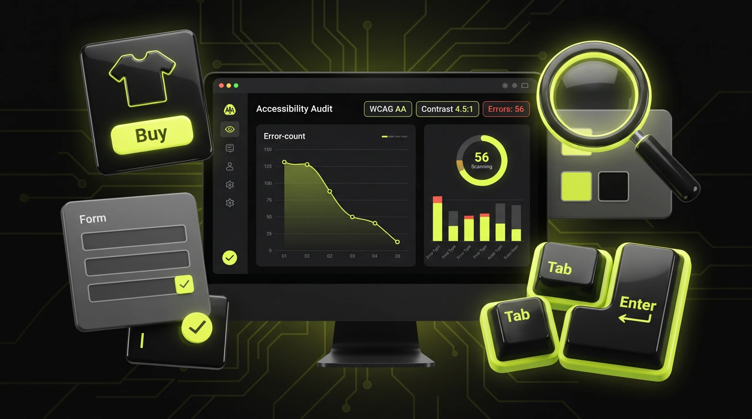
⚡ Quick answer: Since 28 June 2025 the European Accessibility Act has applied across the EU, and it covers online stores selling to consumers in the Union regardless of where the company is registered. Microenterprises providing services (fewer than 10 staff and no more than €2 million turnover) are exempt. Meanwhile 95.9% of the top million home pages have detectable accessibility failures, and 96% of those errors fall into just six types. Most of them are fixed at the design and front-end level in a matter of days.
We touched on accessibility in our overview of design trends, where it was one direction among several. This article is practical: who the law applies to, what breaks on most sites, and how to check your own without hiring an audit firm.
Directive (EU) 2019/882 doesn’t cover every website — it covers specific products and services. For a web studio and its clients, the key category is e-commerce services.
The text of the directive defines them as services provided at a distance, through websites and mobile apps, at the individual request of a consumer with a view to concluding a consumer contract. Put simply: if someone can place an order on your site, that’s e-commerce under the law. A brochure site with no online ordering usually falls outside that definition, although the directive separately covers banking, transport, e-books and audiovisual media services.
| Situation | Do EAA requirements apply? |
|---|---|
| Store sells to consumers in EU countries, company has 15 employees | Yes |
| Same store, but 6 employees and turnover under €2 million | No — microenterprise exemption for services |
| Store with no sales or delivery to the EU | No, though national rules may differ |
| Corporate site with no online ordering | Mostly no |
| B2B platform where only businesses buy | The directive targets consumer contracts, so usually no |
A few details that are often reported inaccurately.
The microenterprise exemption covers services only. Article 4(5) exempts microenterprises specifically from the service requirements. The test is fewer than 10 employees and annual turnover or balance sheet no higher than €2 million. Once a company grows past that threshold, the requirements start to apply.
There is no single EU-wide fine. Article 30 leaves penalties to member states: they must be “effective, proportionate and dissuasive”, but each country sets the amounts. So any figure like “fines of up to X euros” without a country attached is incomplete.
There is a transition period, but not for your website. Until 28 June 2030, products already used to provide a service before 28 June 2025 can stay in place — that refers to equipment such as terminals, not to new pages on an online store.
There’s also a “disproportionate burden” provision (Article 14): requirements don’t apply where they would fundamentally alter the nature of the service or place a disproportionate load on the business. But that has to be assessed and documented, not simply asserted. This article isn’t legal advice: if you sell into the EU, check the implementing rules of the country where most of your customers are.
The same standard sits underneath rules well outside the Union. EN 301 549, the European technical standard behind the EAA, has been adopted in Ukraine as ДСТУ EN 301 549:2022 — according to the Digital Inclusion Monitoring Centre, it has been mandatory for central government websites since July 2023. In December 2025 the government submitted a draft law that would extend accessibility duties to private companies providing electronic services. We mention it because we’re a studio based in Ukraine and watch it closely, but the broader point holds for most markets: accessibility requirements are spreading from the public sector into commerce, not the other way round.
For the wider legal checklist for a website — privacy policy, cookies, form consent — see our separate piece on website legal requirements.
The WebAIM Million 2026 report scanned a million home pages. The picture repeats year after year — the same failures — and it’s getting worse: errors per page rose from 51 to 56.1.
| Failure | Share of home pages | Whose responsibility |
|---|---|---|
| Low contrast text | 83.9% | Design |
| Images missing alternative text | 53.1% | Content and front-end |
| Form inputs missing labels | 51% | Design and front-end |
| Empty links | 46.3% | Front-end |
| Empty buttons | 30.6% | Design and front-end |
| Missing document language | 13.5% | Front-end |
Look at the third column. The top failure and half the rest are baked in at the mockup stage, before a developer opens an editor. That’s why at Netloria we check accessibility during design rather than after launch: fixing contrast in Figma takes a minute, while on a live site with a hundred templates it’s a project of its own.
On average each home page has 34 separate instances of low-contrast text, up 15% in a year. WCAG 1.4.3 requires a ratio of at least 4.5:1 for normal text and 3:1 for large text. Large means at least 18 points, roughly 24 pixels, or 14 points bold — about 18.5 pixels.
The usual offenders: light grey text on white chosen “for a lighter feel”; white text over a photo with no overlay; placeholder text in form fields; tiny captions under prices. Sound familiar? On an expensive monitor the mockup looks clean, and on a phone in sunlight the text simply disappears — which hurts not only people with low vision, but anyone who steps outside with their phone.
A screen reader reaches an image with no description and reads out the file name — something like “IMG underscore 4471 dot jpg”. For a product photo, that means a blind shopper never learns what the item looks like. The rule is simple: a meaningful image gets a short description of what it shows; a decorative one gets an empty alt attribute so the reader skips it.
The most common design habit that breaks accessibility is using a placeholder instead of a label. Grey “Your phone” inside the field looks minimal, but it vanishes the moment someone starts typing, and it usually lacks sufficient contrast. A screen reader often doesn’t announce what the field is at all.
The cart icon, the close cross, the slider arrow, the social logo in the footer — all buttons and links with no text. Visually obvious; to a screen reader, just “button”. The user hears “button, button, link, button” and can’t tell which one opens the cart.
The objection we hear most often from business owners is “we hardly have customers like that.” The problem is that accessibility affects a far wider group than it seems, and most of them would never describe themselves as disabled. A shopper over 60 who can no longer read small grey type. Someone with a broken arm using only a keyboard for a week. A person with dilated pupils after an eye exam. A driver dictating a search by voice. Anyone outdoors on a sunny day. When we at Netloria fix contrast and form labels on a project, we almost never pitch it to the client as “accessibility for disabled users” — we pitch it as usability for everyone, because in practice that’s exactly how it works out.
There’s a second argument. Alt text, a proper heading hierarchy, a declared page language and descriptive link text are the same signals search engines and AI assistants use to understand a page. Google doesn’t promise a ranking bonus “for accessibility”, so don’t sell it as an SEO trick. But cleaner structure has never hurt anyone.
A popular market offer is an overlay script that “automatically makes your site WCAG compliant” — a small panel in the corner with “larger text” and “high contrast” buttons.
A telling case: on 22 April 2025 the US Federal Trade Commission approved a final order requiring accessiBe to pay $1 million. The company had claimed its plug-in could make any website WCAG compliant. The FTC found those claims false, misleading or unsubstantiated and barred the company from repeating them without evidence.
The logic is straightforward. A script doesn’t know what a product photo shows, doesn’t understand what each form field is for, and can’t rebuild navigation that doesn’t work with a keyboard. It can repaint a page, but it can’t repair structure built into the design and code.
A full conformance audit is specialist work. The main problems, though, are visible without one.
That last one is underrated. A red border with no text is a message invisible to people with colour vision deficiency — and they make up a noticeable share of men.
| New site | Existing site | |
|---|---|---|
| When to build it in | In the design system: colours, type sizes, button states | After an audit, starting with the most-used templates |
| Biggest impact | A palette with verified contrast and labels built into form components | Contrast, alt text, forms and icon buttons — the same six failures |
| Effort | Adds almost no time if done from the first mockup | Depends on the number of templates and plugins |
| Typical trap | Mockup approved “by eye”, contrast never checked | Home page fixed, cart and checkout left untouched |
For an existing store, the priority isn’t the home page but the path to purchase: product page, cart, checkout. That’s where friction costs money, and that’s where custom icon buttons and placeholder-only forms tend to live.
Each of these is fixed in hours, not weeks. The difficulty isn’t technical but organisational: accessibility needs to be on the mockup sign-off checklist, or it only comes up when it’s too late.
If you sell into the EU, plan to, or simply want every shopper to be able to use your store — tell us about your project. Netloria is a web studio based in Ukraine; we’ll check your purchase path against these six failures and tell you what can be fixed within your current design and what needs template changes.