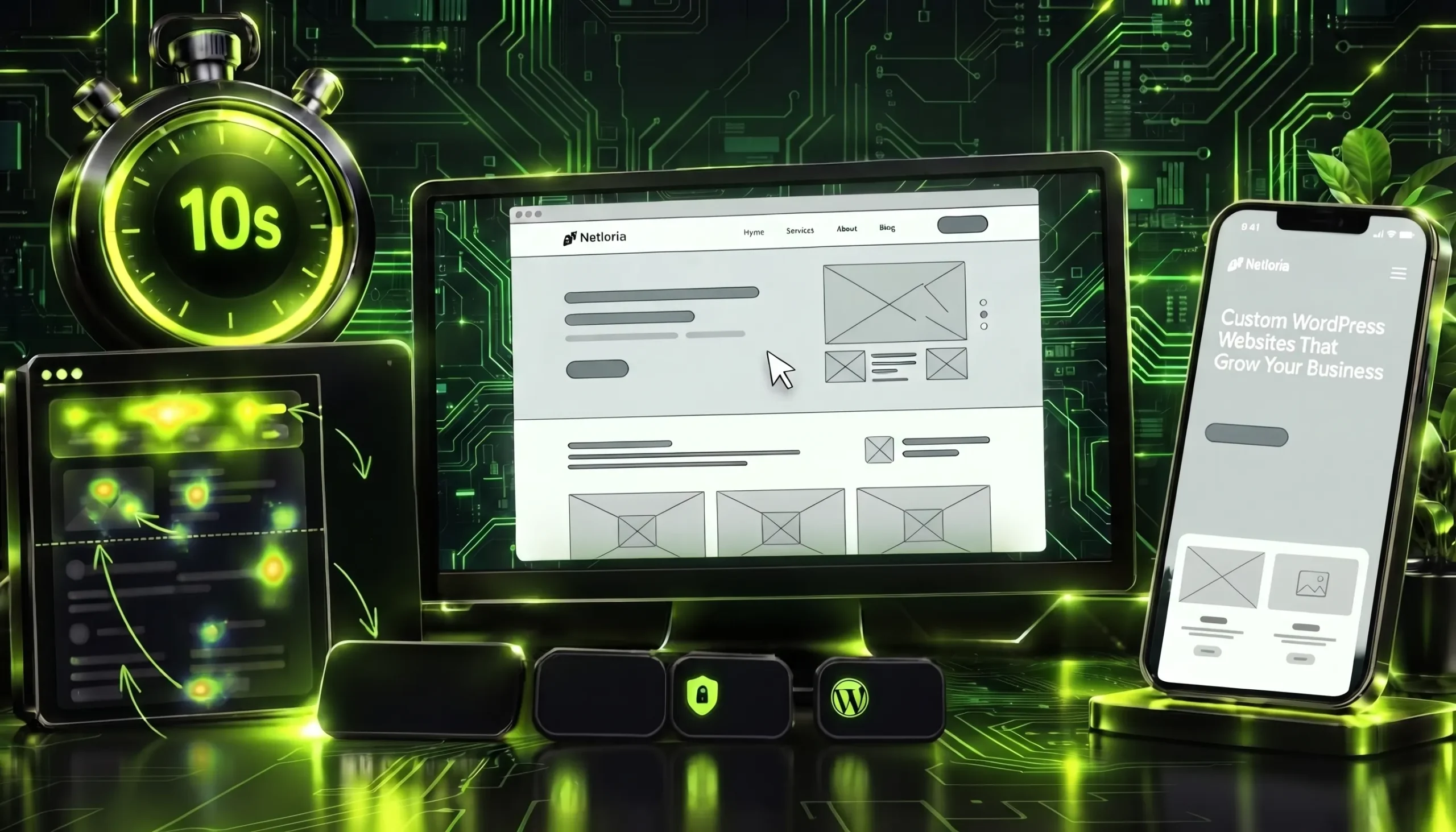
A client shows up with the answer already in their head: «build it like our competitor, only better». A week later the designer presents the first mockup, and it turns out everyone pictured «better» differently. One expected a full catalogue on the homepage, another wanted a large lead form taking up half the screen, a third imagined a full-width video and almost no text. A prototype exists precisely to catch that gap on a grey wireframe, not after half the pages are already built and wired to the backend. At Netloria, a web studio based in Ukraine, no multi-page project goes into development without this step, and below I explain why it is not paperwork but a way to avoid paying twice.
A prototype is not a picture «to approve». It is a decision made before that decision got expensive.
The confusion starts with the words. People say «prototype» and mean three different things, each with its own purpose and its own cost of getting it wrong. A wireframe answers «what goes where, and in what order». A mockup answers «how it looks». An interactive prototype answers «how it behaves when you click it». Keep those three apart, or the client stares at grey boxes and thinks they were handed a half-finished design — when in fact colour and typography deliberately do not exist yet at this stage.
| What it is | What it shows | What is deliberately missing |
|---|---|---|
| Wireframe | Grey blocks: where the menu, heading and button sit, and in what order content flows on each screen | Colour, fonts, real photos — so nobody argues about a shade before the structure is agreed |
| Mockup | The same wireframe, now in colour with fonts and images — a static, «painted» page | Clickability: buttons do nothing, there are no transitions between screens |
| Interactive prototype | A mockup where buttons and transitions work — the site can be «clicked» before a single line of code | Code, a database, real data and real loading speed |
In practice one project often uses all three: first a wireframe to agree on logic, then a mockup to agree on the look, and where needed a clickable prototype for complex flows — checkout, a multi-step form, a user account. A simple landing page is fine with a wireframe and a mockup. An online store with filters and a cart, without a clickable version, risks exposing a navigation problem only on the live site.
The main argument against prototyping sounds reasonable: why pay for schematics when you can just build and see the result. The catch is that a change on a wireframe takes a couple of minutes in Figma, while the same change on a coded page means rewritten HTML, broken mobile responsiveness, checking every page and testing all over again. Software engineering describes this with the 1:10:100 rule: a defect fixed at the requirements-and-design stage costs one unit; at the testing stage, roughly ten; after release, over a hundred. The exact figures vary by project, but nobody disputes the direction — the later you discover that a structure does not work, the more painful it is to change.
Translated into a web studio’s language, this is simple. A client who signs off a wireframe after an hour of discussion saves weeks. A client who says «let’s just start and figure it out as we go» almost always comes back with «can we move everything around here» — when «here» is already expensive to move.
A prototype is not about beauty. It is about decisions that are hard to reverse later. Here is what actually surfaces on grey wireframes and almost never surfaces at the «it’s obvious anyway» stage:
Sound familiar? If you have ever launched a site and spent the week after go-live shuffling blocks around, that is the case where no prototype existed.
Not every project needs the same level of detail. A useful way to hold it in your head: the more money and pages at stake, the more thoroughly you agree things «on paper» first.
| Level | What it is in practice | When it fits |
|---|---|---|
| Low fidelity | Grey wireframes, sometimes by hand or in a simple editor — fast, cheap, easy to throw away and redo | Early on, while people still argue about the structure and the set of pages |
| Mid fidelity | Tidy wireframes with the real block order and draft text, but still no final design | Agreeing the logic with the client before the designer spends time on a polished mockup |
| High fidelity | A colour, clickable prototype, barely distinguishable from a finished site | Complex flows, an investor pitch, testing with real users |
A common mistake is to jump straight to high fidelity. A pretty clickable prototype looks convincing, and the client approves it emotionally, «because it’s nice», without noticing there is no way back from the third screen. Low fidelity is deliberately ugly precisely because it forces you to look at the logic, not at the shade of a button.
Prototyping is not one action but a short sequence, where each step leans on the agreed one before it. Here is how it runs on a real project.
At Netloria we deliberately do not skip the first two steps even under deadline pressure, because that is exactly where the decisions hide that later cannot be reversed cheaply. Half a day on structure saves weeks of rework.
Signing off a prototype through the client’s eyes and testing it on real people are two different things, and the second is stronger. The client knows the product from the inside and therefore misses what a newcomer will not understand. Jakob Nielsen’s classic research at Nielsen Norman Group shows that the first five users in a test already find about 85% of usability problems — so to catch the vast majority of navigation errors you do not need a large, expensive sample, it is enough to sit a handful of people from the target audience in front of a clickable prototype and quietly watch where they stop, where they tap the wrong thing and on which screen they lose the thread. Nielsen advises against one big test of fifteen people and suggests splitting the check into three small rounds, reworking the prototype between them — which is why the clickable version earns its keep: it can be tested before a single line of working code exists. You will not find a cheaper scenario.
The test does not have to be a lab study. Sometimes it is enough to show the prototype to three or four people who have not seen the project, give them a task — «find the price and leave an enquiry» — and stay silent. The spot where a person quietly gets stuck is the most expensive mistake you just caught for free.
When Netloria hands a prototype over for review, we say up front what is being decided right now and what is not. That removes half the misunderstandings: the person stops hunting for colour on a wireframe and starts looking at the thing the wireframe exists for.
Honestly: it is not always needed in full. A simple one-page site on a proven template, where the structure is already known and battle-tested across dozens of projects, can be built without a separate clickable prototype — a half-hour wireframe is enough. The risk here is low, because there is almost nothing to rearrange.
Where skipping is a bad idea: a multi-page corporate site, an online store, any project with forms, filters, a user account or non-standard logic. The more screens and scenarios, the more expensive each structural mistake — and the more sense in catching it on a wireframe. The rule is simple: if you cannot describe the whole site on one page, you need a prototype.
A prototype is that rare stage that costs almost nothing compared with how much it saves. It turns «we thought we meant the same thing» into a concrete diagram you can see and fix in minutes. Design style comes after the prototype, but the structure has to be agreed first, or any style rests on a shaky foundation.
If you need a multi-page site that is thought through first and coded second, the Netloria team builds a corporate website turnkey — with a prototype, tested logic and an agreed structure before development begins. Get in touch, and we will show you on your own example what a prototype looks like and what it manages to save.